Thursday, 30 January 2014
Wednesday, 29 January 2014
Group Meeting 29th Jan
Charlotte Edwards Meeting 1 29th Jan
We used our meeting time to have a conversation about our main ideas and to suggest ideas, photographers and other things that could help us with our project, Before the meeting i had plenty of ideas but was unsure of which idea was the best to move forward with and also which idea would work best with the waste theme, this meeting helped me narrow my ideas down to just a few however i am still having a problem with picking my final official idea. To solve this issue i need to research more into each topic and find a area that interests me most and that i am inspired by.
Before going into the group meeting i had my initial ideas mapped out on a mind map to help me, the ideas i have at the moment are mainly based on Recycled clothing/ material and also the use of recycled negatives and double exposure for fashion purposes. I knew from the start i wanted to take the fashion genre within this project due to personal interests and the previous ideas mentioned were the first to come to mind and these are the ideas i feel would work best with the theme of waste.
Theme 1
Using charity shops from medway to create fashionable/ High end portraits, i will only use charity shops from medway and plan to create original fashionable images.
Theme 2
The use of “rubbish” material taking inspiration from Alexander McQueen by using materials like black bin liners and bubble wrap
Theme 3
The use of recycled negatives on the top of new negatives, this idea i would combine with idea 1 or 2
Our group (1) has decided that we should meet at least once a week (At the moment every wednesday) we have indicated that this time is to discuss ideas, photographers and how we are progressing with our projects and also using the time to discuss other projects (Fashion Constructed Image)
Friday, 24 January 2014
Thursday, 23 January 2014
Wednesday, 22 January 2014
2nd year Exhibitions
Exhibition 1
Ephemeral
Framing
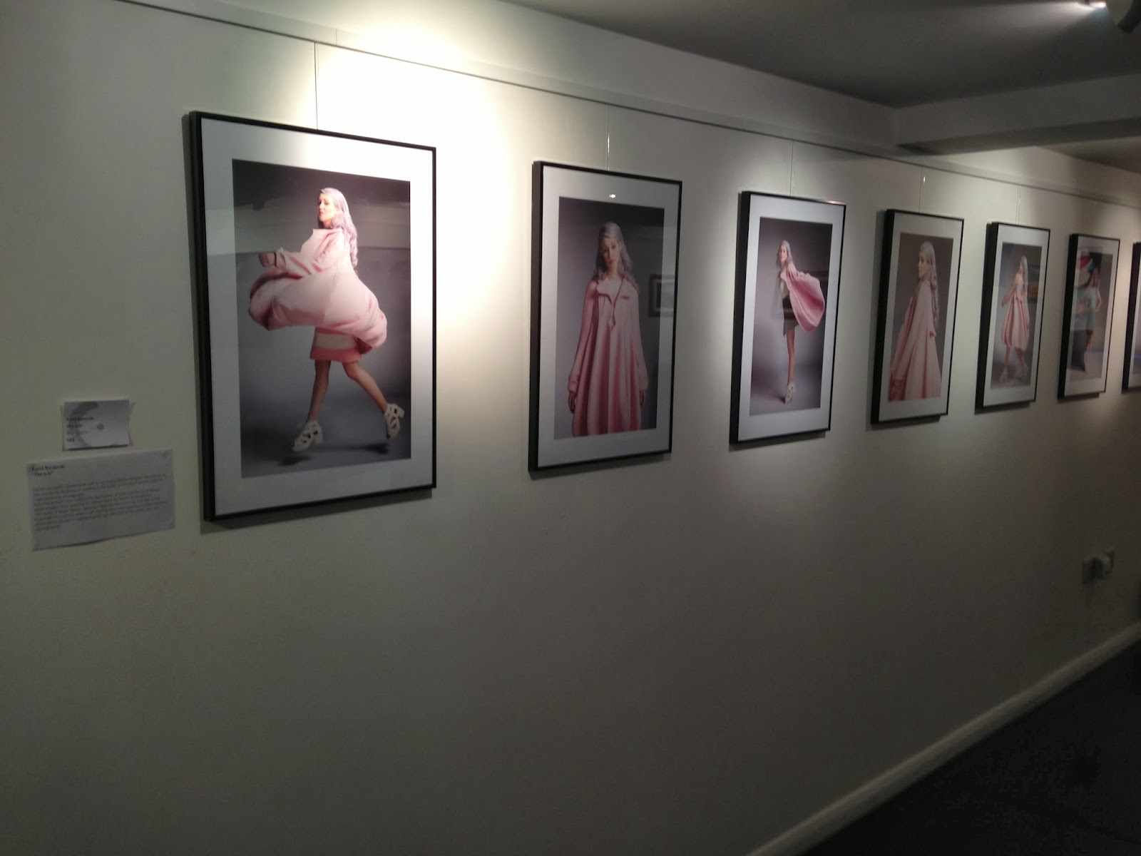
All Works were framed and presented well but i found the work of Kamil stood out to me, this was due to the eye catching series of images that all worked well together i also liked how the images were framed and size of prints.
it was also good how the students included a brief description of their own individual project theme close to the images.
Lighting
The lighting within the exhibition is used effectively for example i like the use of spot lights to draw more attention to the work mounted
Feel Atmosphere
The venue gave the exhibition a "official" and "sophisticated" feel that really complemented the work presented.
Venue
The venue gave the exhibition a "official" and "sophisticated" feel together with beautiful lighting however i did have trouble finding the venue due to it being hidden away.
Extra
I also liked the creative and different ways of showing work for example using other forms of media (tv/Computer)
Exhibition 2
Fon-Du
Framing
All work was presented in a eye catching and artistic way which was consistent throughout all students work. I especially liked the way Agne Bekeraityte used multiple screens to show her moving images, i felt this worked effectively along side with her chosen project theme.
I also really liked how the work of Lily Santer included quotes below her portraits, this gave a narrative to her images and communicated the story of her project.
Lighting
The lighting within the exhibition is used effectively and work was evenly lit.
Feel Atmosphere
Very welcoming atmosphere and enjoyed this exhibition the most
Venue
The venue gave the exhibition a "official" and "sophisticated" feel together with beautiful lighting however i did have trouble finding the venue due to it being hidden away.
Extra
Once again i liked the use of mixed media and video within the exhibition, this exhibition did very well with advertising and designing posters.
I also felt the separate business cards for each student with website information was a very good idea.
Saturday, 18 January 2014
Subscribe to:
Comments (Atom)


